MotionBoard is used to express data useful to your organisation such as sales by product or area. One of the most popular functions when viewing this data is comparisons with the previous year.
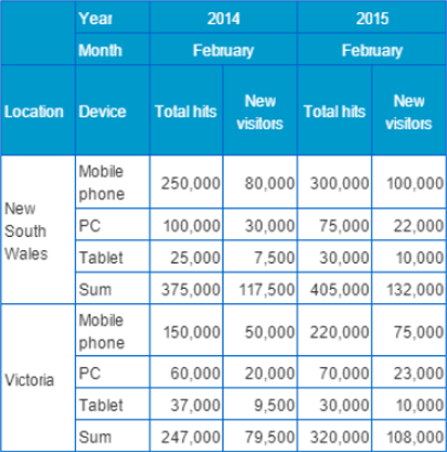
However, if the default table only shows the original data in a row, it can be difficult to perform analysis as individual numbers must be viewed and compared by the user. In this situation, we can add some settings to the default MotionBoard chart to summarise the data into an easy-to-read table.
What makes an effective table?
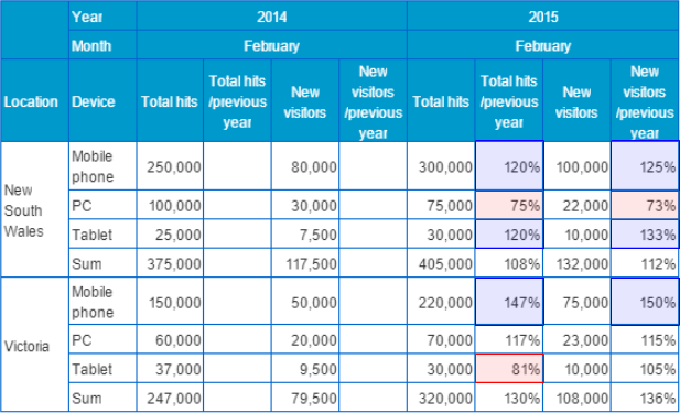
For example, look at the following table. In this scenario, we are viewing the total visits made to a website by location and device. We can see the location and device that the users are viewing the website on in the columns on the left, followed by the total hits and number of new visitors. Is it possible to tell whether the visits are increasing or decreasing year-by-year at a glance? Unfortunately, a table full of raw numbers is not easy to read.
So, how about adding a calculated column for comparison? Here, we have added a column with a percentage value, describing the total hits or new visitors as a proportion of the previous year.

Now we only need to look at one column to see an increase or decrease in visitors.
We did this by creating a “post-calc” item. The new column’s data is calculated within MotionBoard, based on the columns selected by the user.
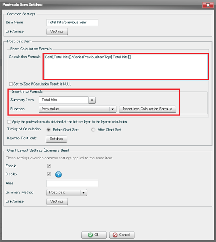
First, go to Data Source Editor, then click Create Additional Item on the bottom left of the window and select “post-calc item”. There will then be a space to add a formula.
You can insert items into the formula such as the current or previous value of an item, selecting from a list. For maximum customisation, you can also edit the formula directly.
The table has become a little better by adding these columns, but there are still some improvements we can make. Rows of numbers do not make for easy reading of data.
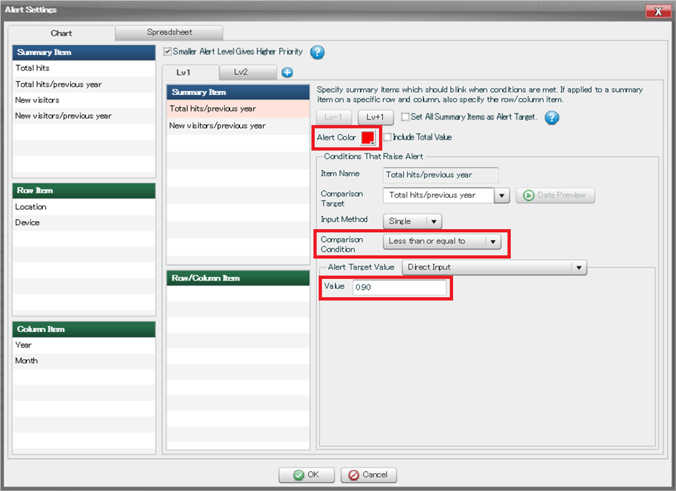
By using the alert function, we can see at a glance whether there has been a dramatic increase or decrease in visits.
Using alerts
We go to the alert settings through the “Edit Data Source” menu. Conditions such as “greater than”, “less than” and “equal to” are chosen.
We have decided that if the ratio of total hits to that of the previous year is 90% or less, the cell will be shaded red, and if the ratio is 120% or above then it will be shaded in blue.
Alerts can be seen in practice here. The data has become a lot easier to understand at a glance, with attention drawn to dramatic increases and decreases from the previous year.