Back in the middle of 2020 we took a look at how lockdowns here in Melbourne had affected mobility in and around the city. Two years on, with the city gradually returning to life, we take look at how things have changed, through the lens of some of the public data on the movement of people around the city.
First up, let's check in with the pedestrian data. This comes from the City of Melbourne's 54 automated sensors located across the CBD, and is released on the Melbourne open data portal.
You don't have to look hard to see the impacts of Melbourne's lockdowns. And while pedestrian numbers across the CBD have started to rise again, they're still some way off the typical numbers seen in 2019:
Retail vs Transit
In our 2020 blog post we looked at the differences between foot traffic in 2 key retail destinations in the Melbourne CBD (Bourke Street Mall and Melbourne Central shopping centre) versus Melbourne's two major train stations (Southern Cross and Flinders Street). Unfortunately, while it seemed at the end of 2020 that foot traffic was returning to Melbourne's retail heart, additional lockdowns in 2021 saw that year take a very similar trajectory to 2020.
In the charts below you can compare both the lockdown affected years of 2020 and 2021 against 2019 at these four key CBD locations:
Mobility Data
We also looked at another data source back in 2020: the mobility data published by social media giant Facebook (or Meta as it is now known).
This dataset shows how much people are moving around compared to a baseline period (in February 2020) that predated most of the global lockdowns and social distancing measures. Looking back over the last two years, it is interesting to compare the experience of different Australian states: while mobility in Queensland was largely unchanged from the baseline once the initial 2020 lockdown eased, it was a very different story in Victoria and NSW.
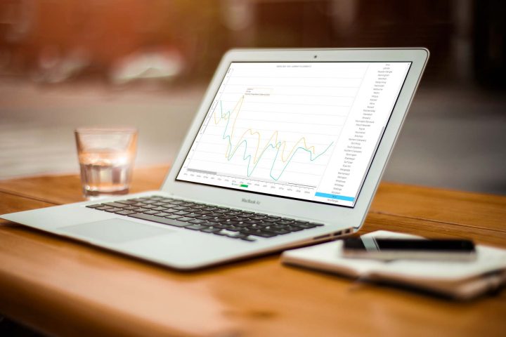
In the updated charts below you can use the buttons across the top to dive into individual states and explore the situation across different show the break. Once you have selected a state, use the list on the right to select and compare movement patterns within specific regions.
Thanks for Stopping By...
We're WingArc Australia. We make software for exploring big data sets, unlocking insights and driving decision making. Want to know more?