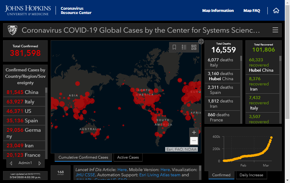
As the world comes to terms with the impacts of the ongoing COVID-19 health crisis, data scientists and data journalists have stepped up to track and report on the data behind this global health emergency. There are some great resources now available to see the scale of this unprecedented event, and in this post we round up some of the best data visualisations and dashboards we've found so far.
The Best Global Overview
The Johns Hopkins University dashboard is the best source for an up-to-date picture of the evolving global situation. The team have also made all their underlying data (collated and updated through a mixture of automated and manual sources) available through GitHub for other projects to reuse.
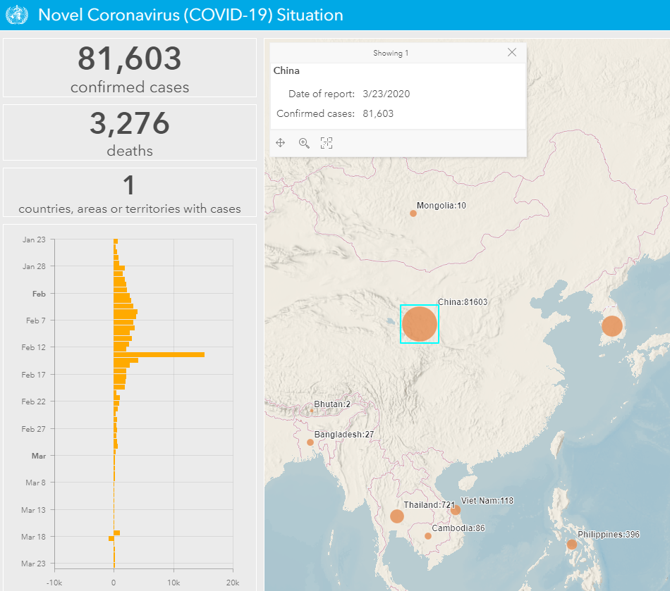
A similar dashboard from the World Health Organisation gives a good overview of the current global picture. It also includes a really useful timeline for each country, such as the one shown here, which graphically demonstrates how the strict measures imposed in China eventually brought the situation under control there:
Note that the spike shown on the 13th February in the above chart is due to officials in China changing the criteria for counting diagnoses of the virus. Data prior to that date only included patients who had received positive results from a lab test. From the 13th February onwards, the counts also included clinical diagnoses.
The Best Australian Overview
Curated by Aussie journalist Juliette O'Brien from media reports and state government announcements, and updated about twice a day, covid19data.com.au is the best overview of the situation in Australia.
Particularly worth a look is the chart showing how the situation has unfolded in different countries since their 100th case. You can use the filter at the top to compare specific countries:
Who Is Testing?
With a global shortage of testing kits, most countries have had to make decisions about who to test, meaning the true numbers of cases are likely to be much higher than reported. Here in Australia, for example, testing has mainly been on only those who have either been in close contact with a confirmed case or who have recently travelled overseas. That said, Australia is still doing more tests than many other countries, as this report from Our World in Data shows:
Notable Mentions
Notable mentions to some great data journalism from the New York Times, as well as this great timeline showing how the situation has evolved over time.
This data story from Australia's national broadcaster, which compares the response across different countries, is also well worth your time.
From all of us at WingArc, we hope you and your families are keeping safe during this difficult time.
Remember that the best things you can do to help slow the spread of the virus are to wash your hands properly, and practice social distancing (stay at home). It might sound simple, but it really will save lives.


